Gina's website feedback
Today, I researched Gina's site in Internet Explorer, Firefox and Google Chrome. I look closely at the fonts, navigation and some effects, when the page was loaded, however I cannot find any difference between them. So that I started to research different page of her website.

Firstly, when I open her website, here show me a scroll bar for welcome the user, It is very interesting and can attract user's attention.
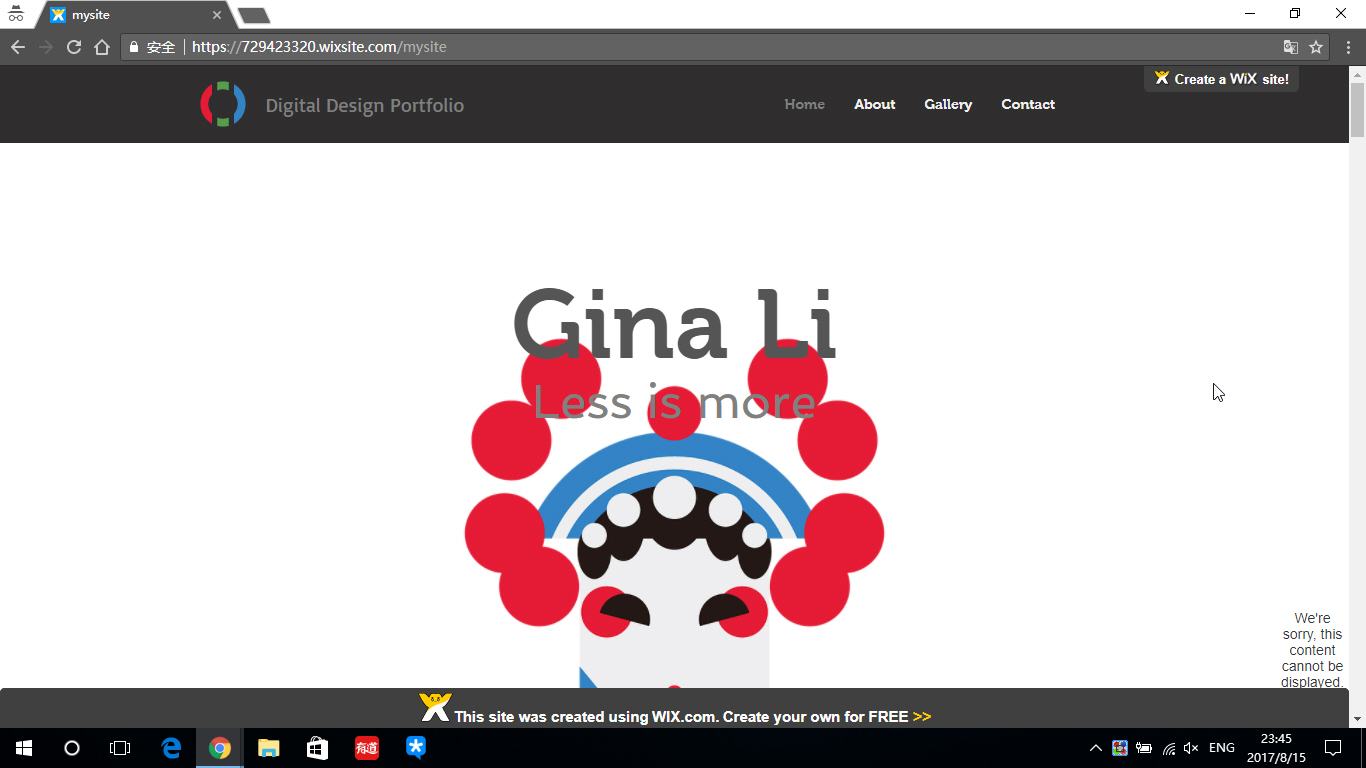
In her homepage is very clear and high-grade, Just focus on her name, slogan and digital work. I like this low-key simple and elegant concept.


Here is her about page, she also use classic simple style. It has beautiful interface and user can easy to get information.

Here is gallery page, it covey the young's desire to be mature while have personality by simple colors and generous clipping.

Finally, here show me a contact page, I think she find the right balance between simplicity and use judicious use of visual effect.

