Website Re-Design gallery Page
I will improve the fashion gallery page of my website design, include background, font and layout:I will remove the unnecessary link on my portfolio of my gallery page and change my font on my gallery page.
- I used seven different fonts in this gallery page, now I will improve it because too many different fonts, colors and graphic styles will hold the users up.

- I improved my font in three different types that were easy-to-read, respectively were Play, Arial and Cooper std. It looks more attractive and harmonize. So I tweaked fonts, made sure everything is consistent, these all result in a very professional and usable website design.


- I will remove the button"Get in touch" that I highlight in red circle, because it not linked to anything, and many users will feel confuse.

- I removed the the button"Get in touch", and got a better presentation.

- The screen shot above show the process of get "get in touch" remove. I didi it in Wix editor by selecting button button settings.

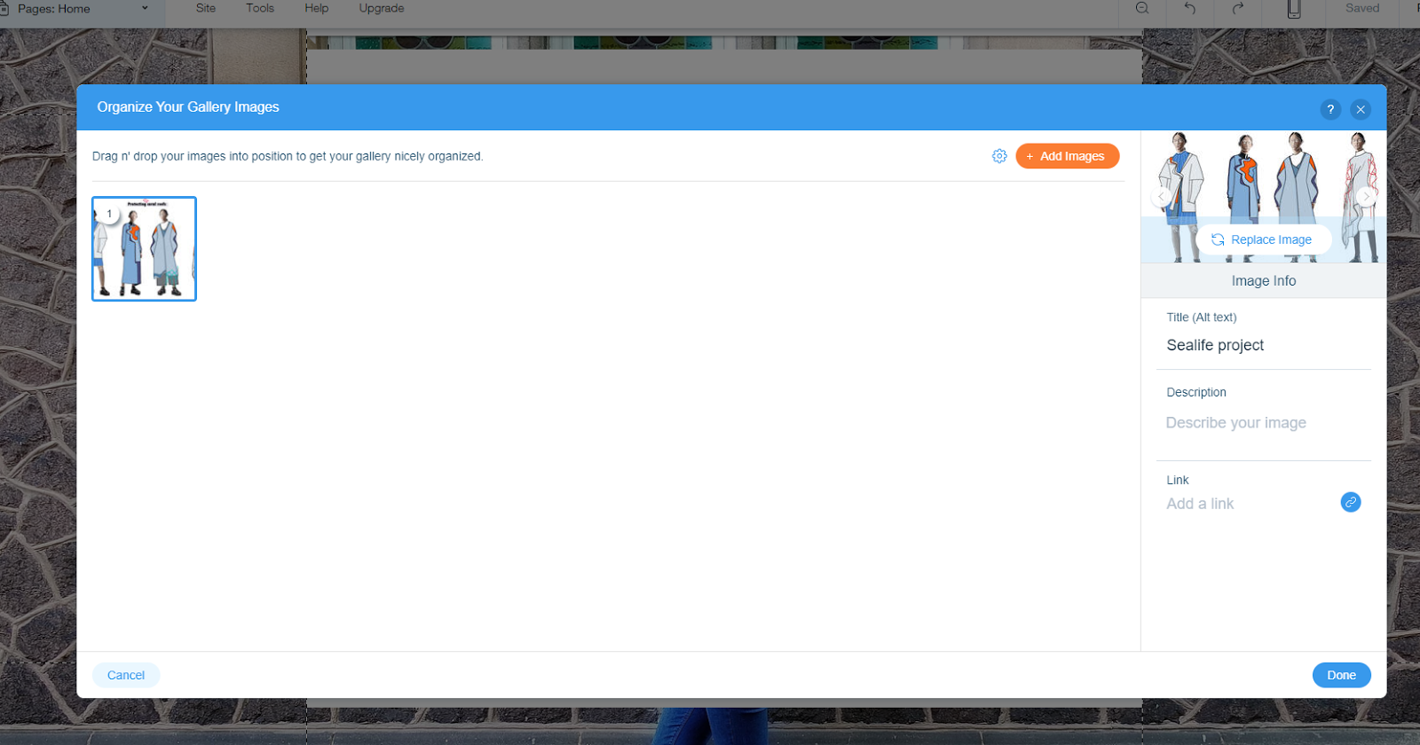
- This is a slideshow template, I didn't need this option in every portfolio page. This is default setting in the template of the slideshow.


In order to improve the consistency on the website, I will establish basic page designs for my web pages and stick with the model. Make sure my headings, font size and typeface are consistent too.
This improvement is also apply to my other page design , I will keep the look, layout, navigation,typefaces, and colors consistent on all page. I will choose fonts that easy-to-read, clean and consistent with the user settings of color, font, and so on. I will change the non-tradition and overly creative fonts.
- I will remove the group work project from my gallery page, because I want to focus on my MA major Fashion Design. I want to upload every project that are focus on fashion design.

- After I remove the group work page, I would like edit some picture from my 2d/3d project, because those picture are not very professional. Such as I need remove the excess part below.

- First step, I choose this picture from My Images. Then I use edit tool to crop it.

- Second step, I cropped and sized it and balanced the tone and colour in edit page.

- Third step, as you can see I removed the excess part of this picture and made it more professional. Then I use this way to edit many picture have the same problem.

- Fifth step, I added a new page about my new project for fashion design and wrote introduction to introduce my new project.

- At the same time, I used text editing tools to change my introduction to the size of 15 Play fonts.

- Then I upload my design and wrote title and description for each design by using Organize tool.

Website Re-Design contact Page

- And I find the Icon of Ins , but it is not so necessary, so I remove it. At the same time, I also use text editing tools to change the information fonts to the size of 33 Play fonts. Because in the design of the whole contact page, the font can't more than three in order to ensure the consistency of each section.

Website Re-design home page
- I will remove the instagram icon and link, because I think my social media link is enough. This is not very useful.


- Then I changed my Logo. The method I use is direct shear off the original image, and put my upload photos in the same place again by using the mouse to adjust into the appropriate size.

- I removed all of this picture, because it is not my work making at LIPC, so I will change these images.
- I upload my new project image about protecting coral reefs.

- Then I use text editing tools to change the introduction fonts to the size of 35 Play fonts.

Website Re-design about page
- I removed the timeline of my education, because it is showy but of no practical use or content.

- Then I add a new subpage for more about me about my CV.

Final piece


Conclusion
According to website design experience, I suppsed that the the flat style is the best form of presenting personal information. Geometry, simple elements, bright color and clean lines may constitute a flat style which conforms to the modern's aesthetic view. It can present useful information to a great extent. For example, remove excess, thick and multifarious adornment effect in order to make the page is beautiful simple and clear. Design skills focus on simple design elements, the consistency of fonts and the color. Simplicity is becoming a contemporary aesthetic standard, so the design of the layout is simple but more appealing. The lively personality graphics are full of visual impact. The color is pure that gives readers a kind of comfortable feeling. A large area of white space is to make a distinction between the pictures and information. However, this simple and clear style design is also a challenge for the website. For example, the collocation of color, the font size setting and the collocation of module need to constantly improve.
Reflection
I supposed the website looks clean is very important. In homegape I took advantage of the soft pink include my logo present a fashion of plane visual effect, and bright and transparent icon shows a really positive atmosphere. All the elements are closely together, compact and orderly. In about page, I leave enough comfortable reading space to introduce myself. Moreover, in more about page I use contrasting colors and reduce redundant information to show neat appearance. It is divided into several functional blocks, and each simple graphic is to show a certain aspect. However, there are still many shortcomings in My CV design. Firstly, my picture has occupied too much space. I think there should be more practical experiences which are very useful to show my professional skills. Some details should be given. The existing information is too little which looks a little hollow. Maybe it is not enough to make readers fully understand me. Secondly, the CV needs to add more original elements. The template looks very ordinary, and I need to learn more skills of the layout. The CV only contains the personal information and simple graph splicing that lacks personality elements.However, In gallery page, I think I need keep to write more detail to explain my work. In contact, it is clear and reasonable.


No comments:
Post a Comment