Compare the website open in deferent browser (Google and IE)

Form this picture, I opened it by google chrome,
we can see it different from IE, Opened in the google browser, The button of this have a flash effect, but opened it in IE browser witch didn't have any effect.

I use the IE browser to open the page when there is no animation effect and no flashing effect. Obviously, opening this page with Google Chrome will have a better user experience.

When I opened it using Google Chrome, it would be fun to have an "loading" animation at the beginning.

When I opened the project page of this website, I saw a lot of image that Arranged very neatly,The navigation of this page is on the far left of the page and is divided into five categories. The color of the font and the color of the picture in the page are also harmonious.

In the about page, I saw a lovely digital illustrator, and accompanied by a simple text that the overall feeling to me very simple. In the bottom of the page set up a lot of link of social media.Users can use these links to learn more about this site.

I went back to the home page, I found the heading, subheading and logo is interesting, they used two color to design the word (blue and yellow), This contrasting color gives a strong sense of design, as well as its LOGO of lightning shape is very simple and unique , it can give users a deep impression.


Subsequently, I researched a make-up artist's website.This website use grey pink as the basic color. This colour scheme make this background more attractive.footer area and the icon on the left side and the middle of the title are used write colour that highlignt the theme. Moreover these product pictures are put in asymmetrical placement meanwhile this picture on the home page has been reduced the saturation and enhanced the contrast, these present a good visual effect.he posture of the model is stylish, which also highlights the individual character.

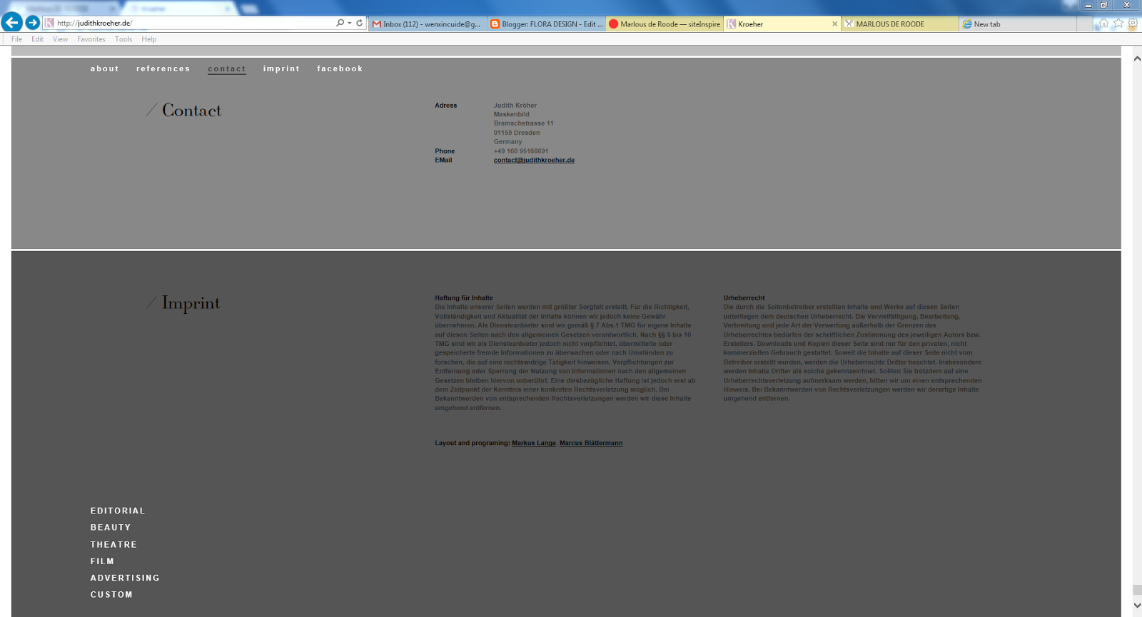
The background colour of contact page and imprint page darkened and increased written message.
However, the background colour and text colour become difficult to differentiate.

Then,I researched three60. we can see this website use large, high-impact images to draw users in and create an immersive experience. This design use a professional photography can create stunning visual experience and offer your visitors incredible user interaction.

Reflection
http://three60.com.au/?project=myopia-campaign


Thank you for uploading those initial screenshots, please add commentary and description. Also ensure to reference everything as per Harvard guide http://www.library.dmu.ac.uk/Images/Selfstudy/Harvard.pdf
ReplyDelete