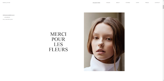
Website consistency
Most people's visual colour is more sensitive than the layout, and easier to form a memory, meanwhile Colour can be one of the key visual factors that links a brand to visual treatment.
2. Layout consistency.
Layout consistency include typography Size, Spacing and Position.Just as color should be based on a palette with style rules, typography needs the same treatment. The concept is the same as with color.
3.Navigation unification.
Further type that’s used in a single location – such as navigation – should be consistent throughout that element. Users will be rather confused if every navigation element uses a different typeface. This consistency applies across the site; all like items should use the same text treatments.
4.Background and image consistency.
Background like brand visuals, such as images and illustrations, should carry across mediums.
This often involves using a common photo set. Some brands have detailed rules for how visuals are used – from colour overlays or watermarks on all images to a certain aspect ratio for all photos.
To do this most effectively, it is important to have a great visual deck packed with high quality, high resolution imagery that we can use and reuse.
5. Element consistency.
The size of elements should be dictated by style and remain the same for every usage. Common size and relationships between elements help users see patterns and create visual flow. These commonalities create harmony and balance that make a design easy to digest and keep users engaged.
Good colour use also helps users move through a website and know that they are still in the right location.Good colour use also helps users move through a website and know that they are still in the right location.
Style and tone of this brand office website and content are simple and clear.
Each page use the same typeface, size and related image.
The look of every element in the design and all associated styles are similar.
Users can engage with design elements such as buttons, menus or icons.
Conclusion
Design consistency creates the structure that the user expects. It also creates a user-aware framework that contributes to overall usability and engagement.
It starts with a set of rules and style guides for each project. Even if we work alone, we can create a list of rules to see how the project uses color, type, size, space, user interface elements, and interactions. It will speed up the design process and lead to better, more usable designs.Reflection
After my study, I found a good web design not only looks good, but also user-friendly. In general, a clean, simple web design will eventually become a highly available web design, because it will not confuse the user with the interaction. When the page has too many website features and components, it will distract the attention of the site users and the original purpose of browsing the site.


Flora, now you need to think how you can use Consistency in Design to create your own website and blog.
ReplyDeleteAlso please customise your blog background by uploading your own image and not using the default setting.
Flora please publish your Live Project blog posts. Please remember to blog regularly.
ReplyDeleteThis comment has been removed by the author.
ReplyDelete