Redesign the homepage, analyse and suggest improvement for the www.leonedesigners.uk
Strengths:
- The homepage of www.leonedesigners.uk , we can see a friendly design.
- User can quick check sigh in and check out process.
- This website have a good host service.
- This website have relevant and unique content.
- User can see a good video which offer some events and show us a beautiful work studio..
- The website is very clear and easy to read.
Weaknesses:
- The background of this website is too simple and not creativity. User just see some logo on it.
- Poor content and image.
- There very few links.
- The colour of this website are quite monotonous.
Opportunities:
- Internet on mobile phone.
- Online transaction.
- Innovative marketing strategies.
Threats:
- Other fashion design website that are strong the this one.
- Because this brand is new, many people might not know this brand.

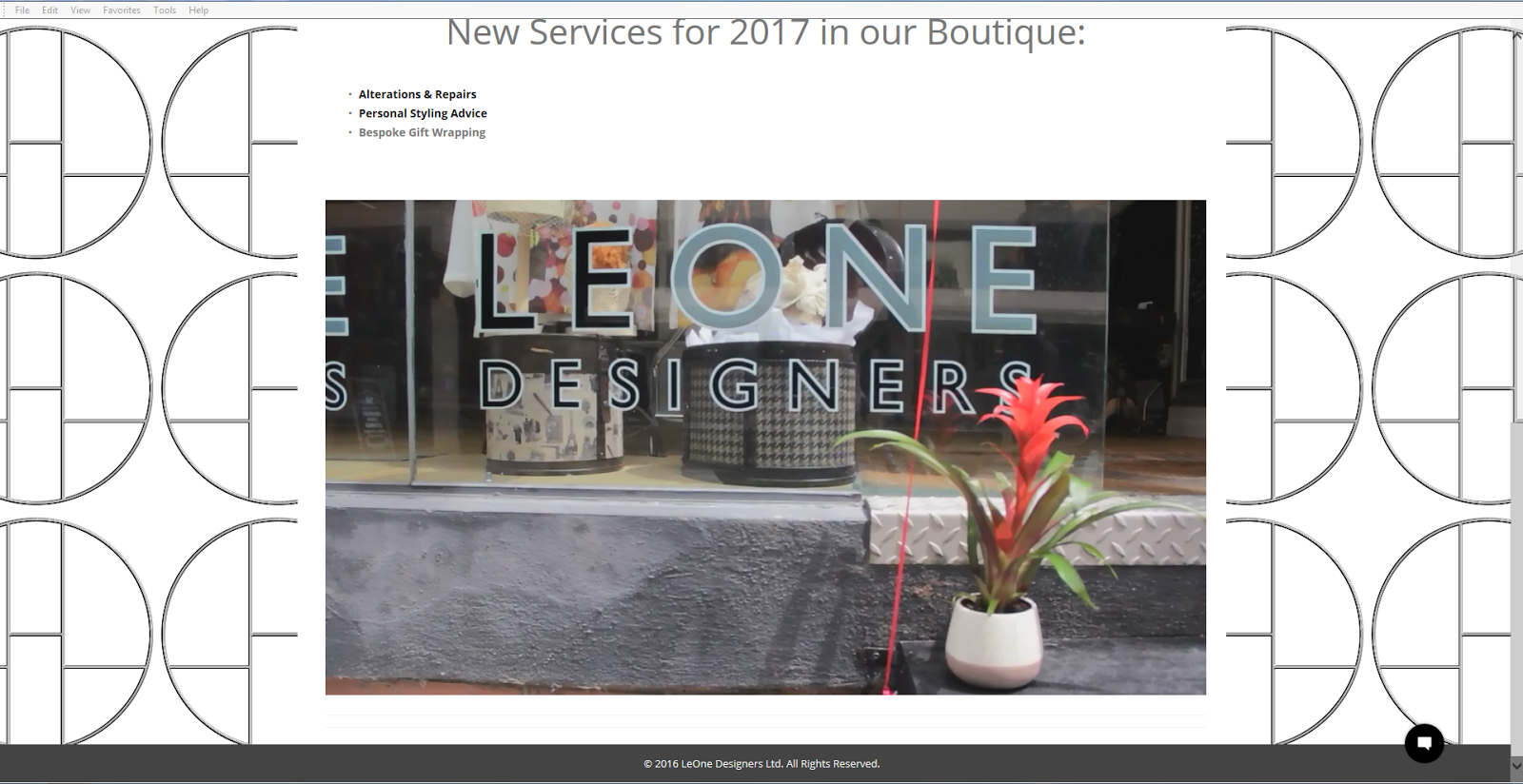
reference: Leone (2017) Leone [Online image]
Available from: http://leonedesigners.uk/ [Accessed 28/07/2017]
Firstly, I researched this website. It have a good slogan that can be attratuct new user. Like "Here you can find a world of handmade in England women's and unisex fashion collections and unique gifts." This message expresses the product positioning and the audience, and this home page use large, high-imapct images to draw user in and create an immersive.

Reference: Lavish Alice (2017) Activity [Online image]
Available from: https://www.lavishalice.com/clothing/new-in [Accessed 28/07/2017]
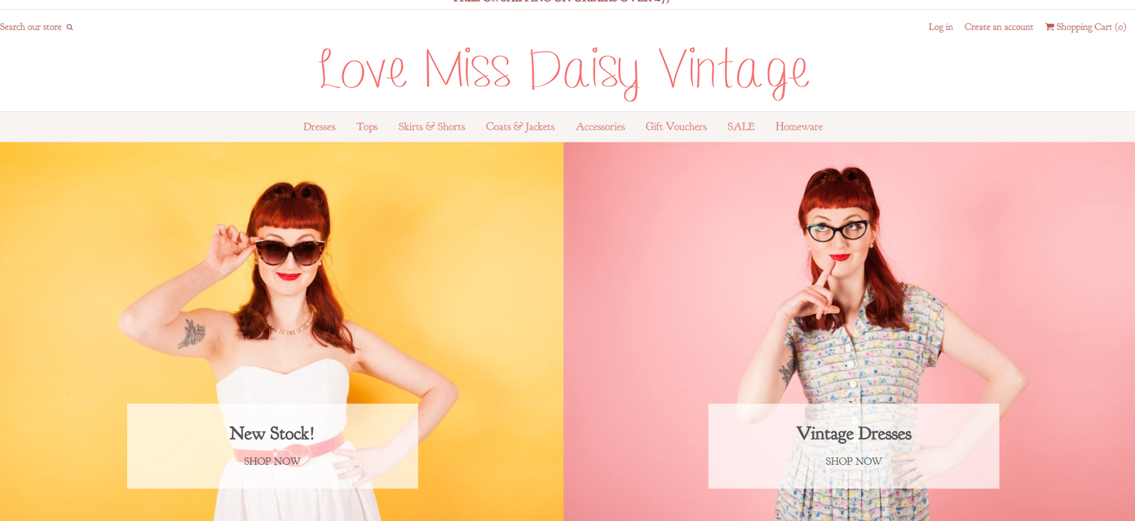
Reference: Love Miss Daisy (2017) Activity [Online image]
Available from: https://www.lovemissdaisy.com/ [Accessed 28/07/2017]
Secondly, I researched other two online shop website design. The first website is Lavish Alice, the second website is Love Miss Daisy, these two website mainly focus for young women, so we can see that, the color scheme is based bright like orange, pink and green. It is thought about the designer use warm and bright colors to creat a warm atmosphere. ite space, which expresses a relaxed feeling. rules and background are clear that can be especially useful for drawing attention to the website.

Thirdly, I started redesign the website on white paper for www.leonedesigners.uk. I wanted to create a big image such as the outdoor photos of Leone shop.then put the logo in left corner of the top. The central part of the web page is heading and slogan. below the heading, I wanted put a video in here. It very clear and can rich the website.

Fourthly, I used the moqups to design the website layout. It is related with my initial idea. It have a simple and clear style, because I think the simpler the structure of the site, the easier it is for users to navigate.

Finally, I choose the image about outdoor photo of the shop. and put a video that can show all of information about their workshop ,studio and design.
Reflection
When I designing a website layout there are some common mistakes that often pop up.
Before starting the work I need to know what is it you are designing for. Besides the description of the site, I need to know what the expectations are for it. I should targete at users'likely interests before it began to do . Avoid design the website don't have any user experiencing.


No comments:
Post a Comment