Monday, 31 July 2017

Website consistency.


Website consistency


1. Colour consistency.

Most people's visual colour is more sensitive than the layout, and easier to form a memory, meanwhile Colour can be one of the key visual factors that links a brand to visual treatment.


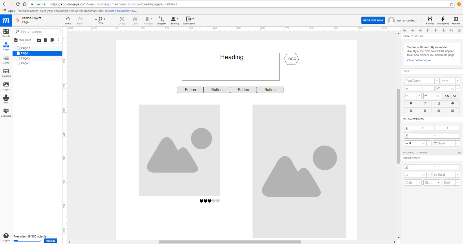
2. Layout consistency.
Layout consistency include typography Size, Spacing and Position.Just as color should be based on a palette with style rules, typography needs the same treatment. The concept is the same as with color.

3.Navigation unification.

Further type that’s used in a single location – such as navigation – should be consistent throughout that element. Users will be rather confused if every navigation element uses a different typeface. This consistency applies across the site; all like items should use the same text treatments.

4.Background and image consistency.

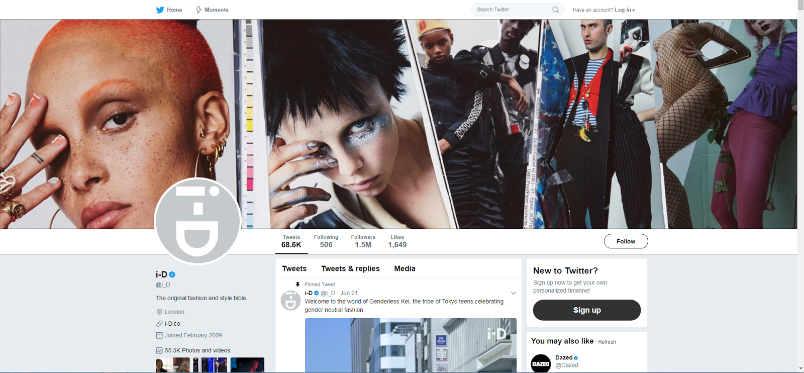
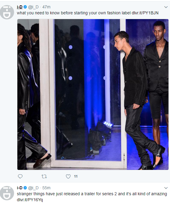
Background like brand visuals, such as images and illustrations, should carry across mediums.
This often involves using a common photo set. Some brands have detailed rules for how visuals are used – from colour overlays or watermarks on all images to a certain aspect ratio for all photos.
To do this most effectively, it is important to have a great visual deck packed with high quality, high resolution imagery that we can use and reuse.


5. Element consistency.

The size of elements should be dictated by style and remain the same for every usage. Common size and relationships between elements help users see patterns and create visual flow. These commonalities create harmony and balance that make a design easy to digest and keep users engaged.


Good colour use also helps users move through a website and know that they are still in the right location.Good colour use also helps users move through a website and know that they are still in the right location. 


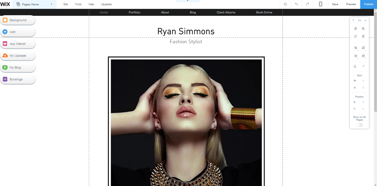
Style and tone of  this brand office website and content are simple and clear.
Each page use the same typeface, size and related image.
The look of every element in the design and all associated styles are similar.
Users  can engage with design elements such as buttons, menus or icons.

Conclusion

Design consistency creates the structure that the user expects. It also creates a user-aware framework that contributes to overall usability and engagement.
It starts with a set of rules and style guides for each project. Even if we work alone, we can create a list of rules to see how the project uses color, type, size, space, user interface elements, and interactions. It will speed up the design process and lead to better, more usable designs.

                                                                          Reflection

After my study, I found a good web design not only looks good, but also user-friendly. In general, a clean, simple web design will eventually become a highly available web design, because it will not confuse the user with the interaction. When the page has too many website features and components, it will distract the attention of the site users and the original purpose of browsing the site.

Wednesday, 26 July 2017

Social media research


Social media research


 This is social media account for fashion magazine I.D from Twitter. I really like this magazine and I am a convinced reader. I saw the layout of home page is very unique and artistic. They posted 68.6k posts on this social media meanwhile they own 1.5m followers and  1649 likes.They are very popular.They posted a lot of fashionable photographs , the new trends and different fashion style.


 This is fashion brand Genderless kei form Tokyo Japen. Their  posts are very regular, nearly 5 posted per day intervals of a couple of minutes or hours. Sometimes they post some videos about different fashion brand from different country.


They recorded many fashion events, and they always took professional and beautiful photograph. They took the model's wearing and expression. The picture above show us this models will step on the runway.


Then, I researched a Fashion student adria tica 's Instagram. He posted many his design sketches and real works process on his Instagram to show his idea. I can see the detail of his work and materials. I think this is very good and give me more idea to design my social media.


In this picture, I saw his idea and sketches. He put many hangtag like #fashionillustration #fashiondesign #fashiondesigner  #conceptualfashion #fashionsketch #instadraw #instaillustration #creatives #art #illustration and so on. He tied to let more people to know his work, and got 37 likes. I think it is good that he try to show bravely himself.


This picture show his work and photography work.  He also put many hangtag that can attract attention.


Then, I researched mattiacordaro' Instagram. I can see many fashion design  by her hand painted on her social homepage, and I can also see her hand-painted personal characteristics.


This is beautiful fashion design that show a rose dress include red roses and blue rose.


This picture, her design two sets of Bohemian style skirt, the main color is blue, holiday style.


She put many work on her Instagram and show some hand drawing, fabric and her basic skill for fashion design.


This picture show her cloth-cutting skill.


This picture show her plate-making skill.


This picture show her free draping skill.

This picture show her hand drawing skill.


This picture show the process of she creating the fabric.


                                                         https://www.instagram.com/adria_tica/
                                              
                                                         https://www.instagram.com/mattiacordaro/
                                  https://www.instagram.com/joelma_ateliersejamais/


hashtag #


Monday, 17 July 2017

Website design process ( include about page, gallery and contact page)

My website design what goals the site needs to fulfill. 
Scope definition: Once we know the site's goals, we can define the scope of the project. I.e., what pages and features the site requires to fulfill the goal, and the timeline for building those out.
Sitemap and wireframe creation: With the scope well-defined, I can start digging into the sitemap, defining how the content and features I defined in scope definition will interrelate.
Content creation: Now that I have a bigger picture of the site in mind, I can start creating content for the individual pages, always keeping search engine optimization in mind to help keep pages focused on a single topic. It's vital that I have real content to work with for our next stage:
Visual elements: With the site architecture and some content in place, we can start working on the visual brand. Depending on the client, this may already be well-defined, but I might also be defining the visual style from the ground up. 

This is my contact page, the catalogues section and web logo are at the top of this page, then blow it are my social media links, telephone number, website link and email address,for the office address location I will present it as a navigation link at the bottom of this page.


Then I develop my initial design on Wix . I have already finished heading design when I design the home page. Then I wrote some brief introduction, and design a email box on this page.


Next, I putted my blog link with icon and social medium link on this page, so as to user contact me. I also put my address.


Finally, I continued to develop my contact page, I change the color with the email box and icon as well as I made this page more colorful than before. It can give user better user experience.


I used the same way to design my about and gallery. If you want to know more about my website, you can go to https://wenxincuide.wixsite.com/mysite. Thank you.

Reflection


Once the blueprint for the site has been defined through the creation of the sitemap and wireframes, the next step is to create a visual style. The overall visual style will most likely be determined by the visual brand of the organization; the goal being to connect the Web with all other forms of the organization’s communications. The organization’s brand plays an important role in this part of the process, as I will want to visually convey key brand perceptual ideas within the design.


Monday, 10 July 2017

Website homepage design (include initial design, Moqups, Research and Wix)

Initial Ideas&Development

I planned to create my own website, first step, I decided  to design my own website page. Fortunately , I have a good idea in my head that I draw website homepage by hand.

Subsequently, I sketched my homepage,Identify what you want to display and name it: Flora's fashion design, then design a logo next to Heading. The second step, in order to make my page classified, I designed a website navigation in the upper right corner of the home page.

The third step,  I designed my home page layout, I wanted to use the size of picture asymmetry.


Blow is my plan.1 for my homepage.


The fourth step, I used moqups to design my own website layout,firstly I put catalogues section at the top of this page, then I put introduction and web logo blew the catalogues, after that I put two of my best design pictures on the center of this page to attract people's attention.


This is an introduction page which is to introduce myself. On the left hand side is text introduction and the right hand side is a photo of myself. Then the catalogues section and web logo will be at the top of this page.


Reflection

In my web design, I take into account the user's visual enjoyment, I designed a more concise page, the use of pale theme color, and then a small amount of bright colors embellishment.  Finally,improve every element and detail to ensure that the page effect of good quality.

Research


At the same time, I researched some portfolio & CV website template in WIX. I will examine this template below. Below is rundown of some of the benefits of simplified website designs, as well as some easy techniques for simplifying our own web design process.
Firstly there are some CV page templates, most of them are colorful and simple. Some of them  selected the photo of themselves to put on this page, but others may selected most attractive pictures on it. 

This is one of the template's home page on the WIX. They selected some interesting pictures at the center of this page, and put the catalogues section at the top of this page and the title blew it.


This is another template's home page on the WIX. They selected some one most interesting pictures at the center of this page, and put the catalogues section at the top of this page and the title blew it.

This is another template's home page on the WIX. They selected some one most interesting pictures as a background of this page, and put the catalogues section at the top of this page and the title blew it.


Reflection

after the research I got more ideas about how to design a website, like how to do a basic layout of the web pages and how to use colors on the pages. Then I also learned a good web design should keep sample and easy to read. For my won web page design I may use vertical design style, because I think it is really simple and easy to read for audiences.


WIX

I started designing my home page with CATIA. Initially, I set a blank page, then set it inside a width of 980PX content area.


 Subsequently, I designed a heading and subheading about my theme and my name with a nice mddle navigation area. 


This is my initial design for my title.


 Then,I uploaded my own Logo on my website and placed it on the right side of heading, and I personally liked the asymmetrical style. 

This picture demonstrate effect of my top web page. This is a simple style that is easy for users to read, and users can quickly know what type of page it is and browse quickly.

Then, I wanted change my web background, therefore I uploaded a background picture that I took. Then I changed the new picture to my  background. 


next, I wrote a brief introduction for my website with cordial greetings, it could give user a good experience and attract they look my other work.


Finally, I selected some of my previous work, with a simple and neat arrangement,This makes the user at a glance, not only  highlight the theme, enhance the beauty, but also make the page looks more harmonious.


Reflection

Through this Project,I learned current standard for width of web designs is 960px, which isn't respected everywhere but it is thought tend to look the best on the majority of resolutions as well as a good web design is not only eye appealing, it's usable, intuitive, simple in hierarchy yet complex enough to keep the user interested. A good web design include good typography, colors scheme, textures, layouts images disposal and so on. Moreover, consistency is key in web design. Overall, I obtain a lot of experience for designing web pages.

Wednesday, 5 July 2017

Term.2 Website Research


Compare the website open in deferent browser (Google and IE)


Form this picture,  I opened it by google chrome,
we can see it different from IE, Opened in the google browser, The button  of this have a flash effect, but opened it in IE browser witch didn't have any effect.


I use the IE browser to open the page when there is no animation effect and no flashing effect. Obviously, opening this page with Google Chrome will have a better user experience.

When I opened it using Google Chrome, it would be fun to have an "loading" animation at the beginning.

When I opened the project page of this website, I saw a lot of image that Arranged very neatly,The navigation of this page is on the far left of the page and is divided into five categories. The color of the font and the color of the picture in the page are also harmonious.


In the about page, I saw a lovely digital illustrator, and accompanied by a simple text that the overall feeling to me very simple. In the bottom of the page set up a lot of link of social media.Users can use these links to learn more about this site.

  I went back to the home page, I found the heading, subheading and logo is interesting, they used two color to design the word (blue and yellow), This contrasting color gives a strong sense of design, as well as its LOGO of lightning shape is very simple and unique , it can give users a deep impression.


Subsequently, I researched a make-up artist's website.This website use grey pink as the basic color. This colour scheme make this  background more attractive.footer area and the icon on the left side and the middle of the title are used write colour that highlignt the theme. Moreover these product pictures are put in asymmetrical placement meanwhile this picture on the home page has been reduced the saturation and enhanced the contrast, these present a good visual effect.he posture of the model is stylish, which also highlights the individual character.


the about page of this website use grey as the basic color. This colour scheme make this  background different as before pages and more serious. In addition, attached artists' photo and brief introduction. I can see Dresden Judith Kröher graduate from College of Fine Arts (Hochschule für Bildende Künste) then she works as a freelance makeup artist and hairstylist. With great attention to detail she has worked in film / television, advertising, theater / opera and photography. Her work is characterized by background, personality, character and passion.


The background colour of contact page and imprint page darkened and increased written message.
However, the background colour and text colour become difficult to differentiate.


Then,I researched three60. we can see this website use large, high-impact images to draw users in and create an immersive experience. This design use a  professional photography can create stunning visual experience and offer your visitors incredible user interaction.


And its gallery page layout is very neat and orderly, the user can easily to get information.

Reflection


Well-designed websites offer much more than just aesthetics. They attract visitors and help people understand the product, company, and branding through a variety of indicators, encompassing visuals, text, and interactions. That means every element of my site needs to work towards a defined goal.

http://judithkroeher.de
http://three60.com.au/?project=myopia-campaign


5. Logo Re-design

Logo is an essential element of a brand which plays an important role in brand communication (Chen, 2008). The distinct and unique logo cont...